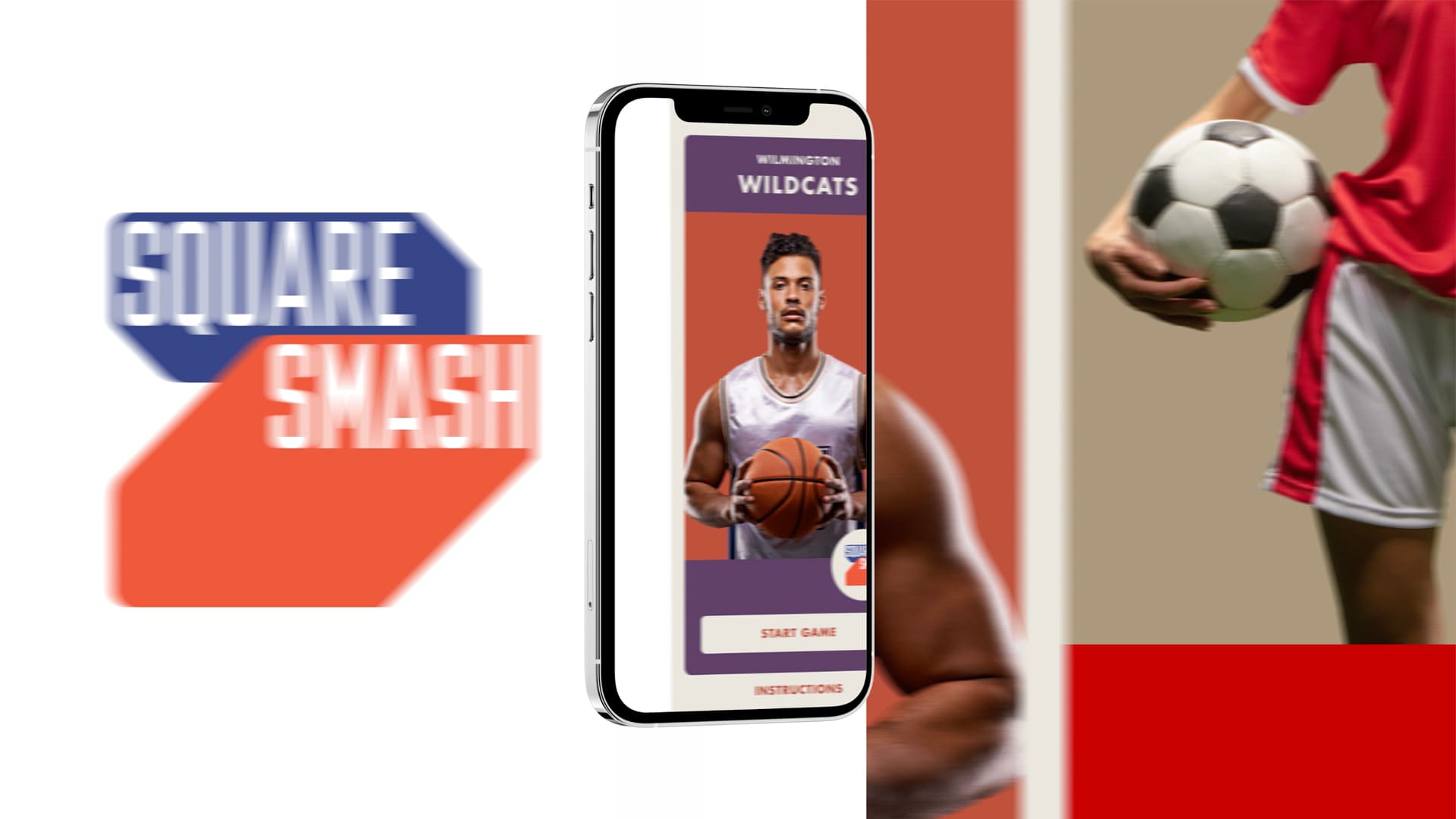
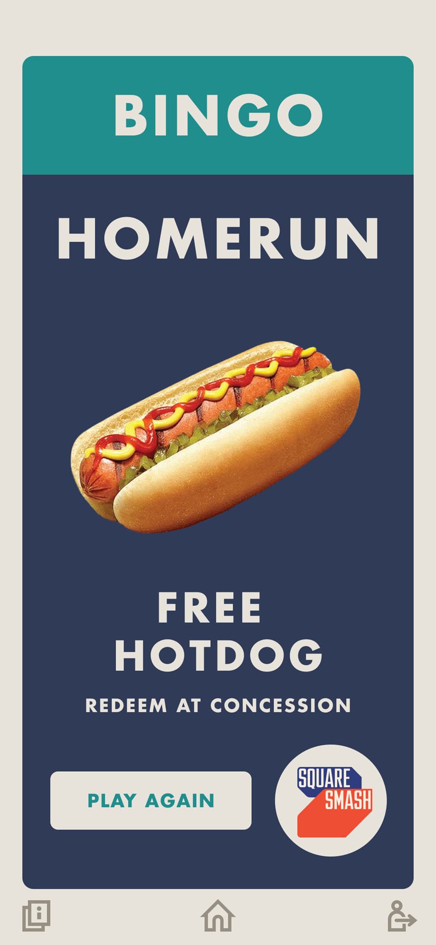
A white-label mobile game app designed for the 7th-inning stretch at minor league baseball games, built to expand into sports events, live entertainment, and beyond.
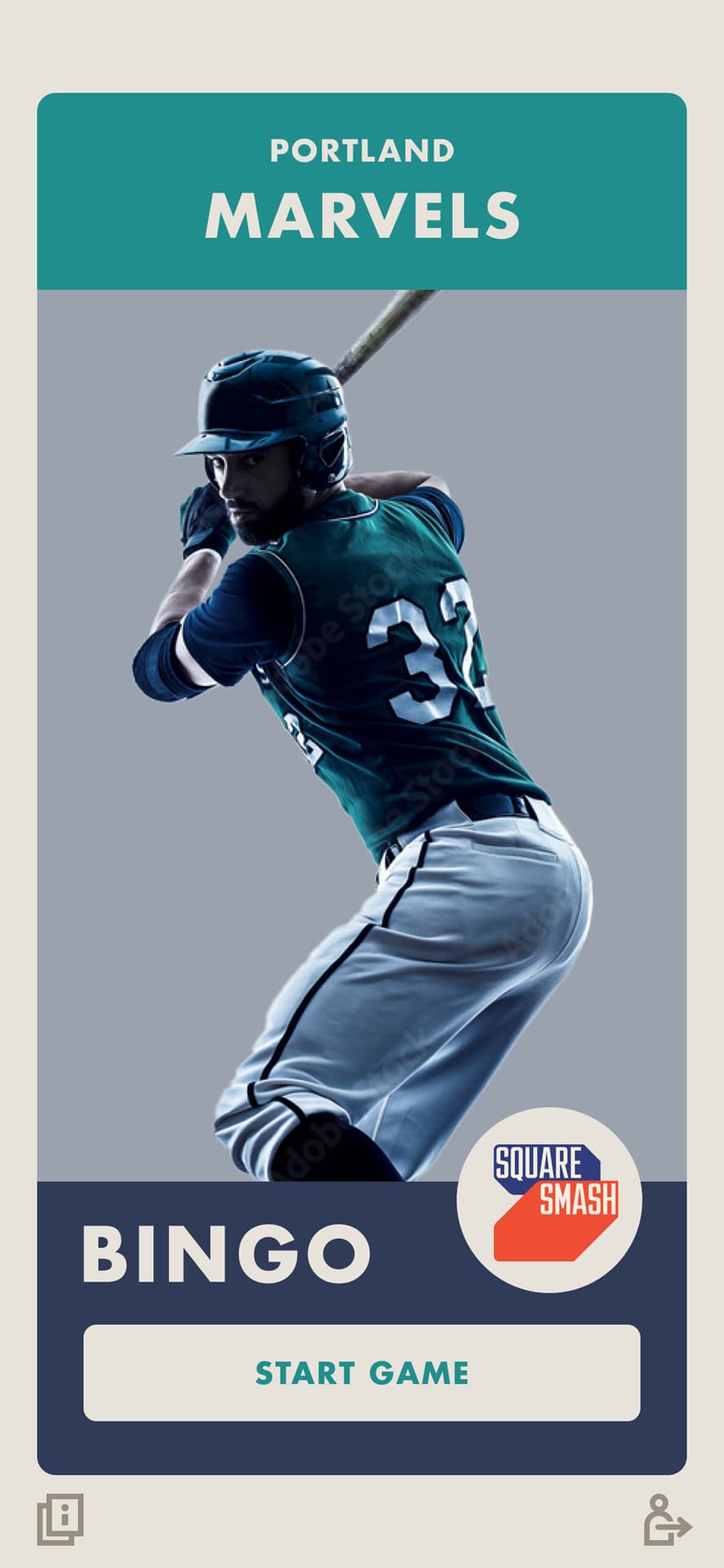
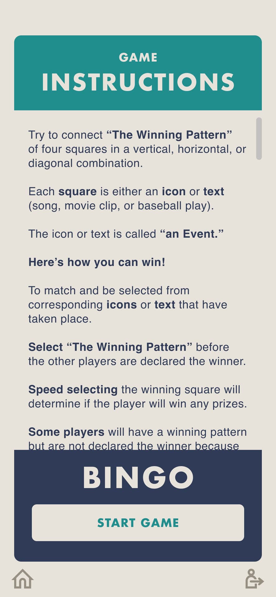
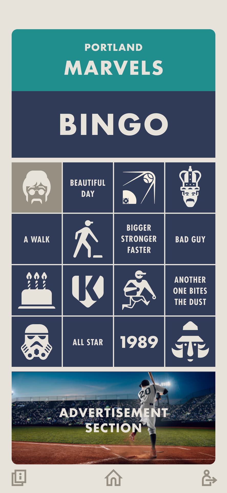
An overview of screens from the Figma file showing the user journey from launch through gameplay.
.jpg)
.jpg)
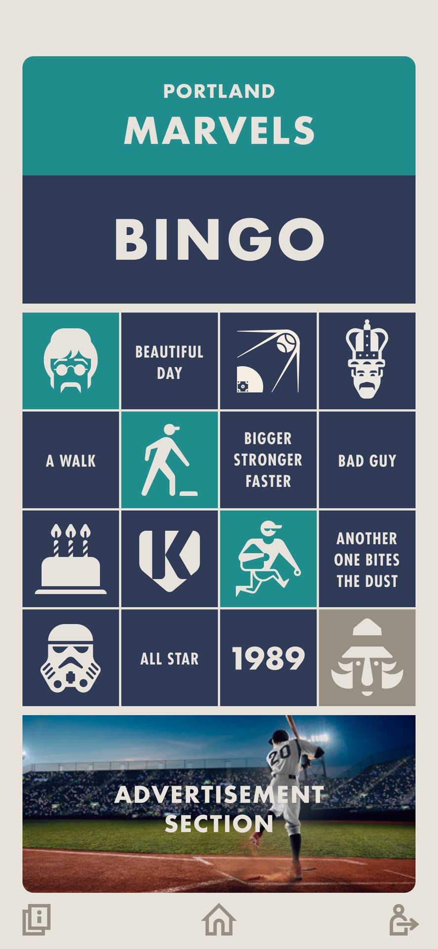
A selection of illustrated pictogram icons designed to read instantly at small sizes across movies, television, music, and baseball, unified in a single brand color so every subject reads as one system. The flat, reduced graphic style was chosen deliberately. It belongs to the same visual era as vintage baseball card design, meaning the icons reinforced the overall aesthetic rather than just solving a readability problem.
.jpg)
.jpg)
.jpg)
.jpg)
.jpg)
.jpg)
.jpg)
.jpg)


A selection of illustrated icons designed to read instantly on small screens, unified by a one-color geometric style across subjects covering different pop culture subjects.
The flat, reduced graphic style was chosen deliberately. It belongs to the same visual era as vintage baseball card design, reinforcing the overall aesthetic of the game rather than just solving a readability problem. The single color treatment unifies subject matter with no natural relationship, movies, television, music, and baseball all rendered in one brand color so they read as one cohesive system.
The app name, Square Smash, came at the end of development with no backstory. Working from the name alone, the mark needed to function as a standalone brand identity independent of any sport or industry. The 3D treatment bridges two eras intentionally, vintage sports print on one side, early video game graphics on the other. Two squares in dynamic collision, a visual echo of the name and a literal nod to fingers smashing tiles on a touchscreen.


![[background image] image of an office space (for a home inspector)](https://cdn.prod.website-files.com/image-generation-assets/a155a359-0a97-4290-953f-9e57041a7549.avif)